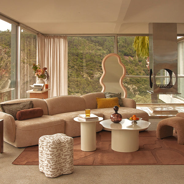
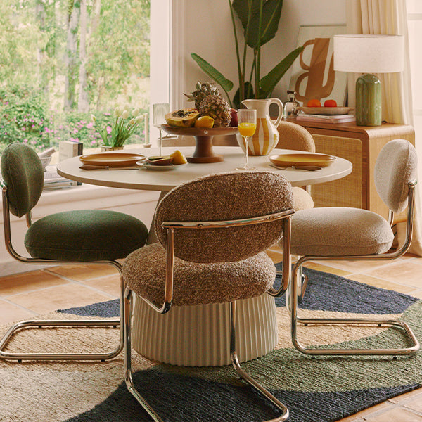
How to use the pastel color palette in interior design
Welcome to the wonderful world of pastel colors! These pretty hues are lighter, softer shades of every color on the color wheel. In other words, pastel colors are just muted, paler, softer versions of the brighter, more vivid colors we use every day! Although we may not realize it, colors have a greater impact on our emotions and moods than we realize. Pastel colors used in a room can help evoke feelings of happiness, pleasure and whimsy! We don't often talk about the pastel color palette, but they seem to be making a comeback in recent years and will continue to be present in decorating trends in 2025!
What are pastel colors?
Pastel colors are pale variations of primary colors, with a lightness and low saturation. To create a pastel shade, you need to mix white with the original color, blending the pigments until they combine completely. The more white you add to the original color, the lighter the pastel shade becomes. Interior designers incorporate pastel colors into their work to blend color palettes, create texture and balance bold patterns.
5 examples of pastel colors
As primary color hues, pastel shades do not appear on a traditional color wheel. Their limited saturation and pale hues easily create a soothing atmosphere. Common pastel hues include :
- Lilac: A blend of mauve and light blue, lilac is a pale shade of purple that resembles the lilac flower. This pastel color creates a vivid contrast with shades of olive green and gray.
- Mauve: Like lilac, mauve is also a pastel variety of violet. There are different shades of mauve, with some hues containing shades of pale pink and others containing shades of light gray.
- Mint green: A blend of blue, green and white, mint green is often a basic hue in a pastel palette. The different shades of mint green vary according to the proportions of white, blue and green.
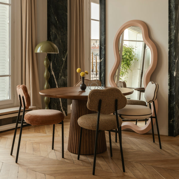
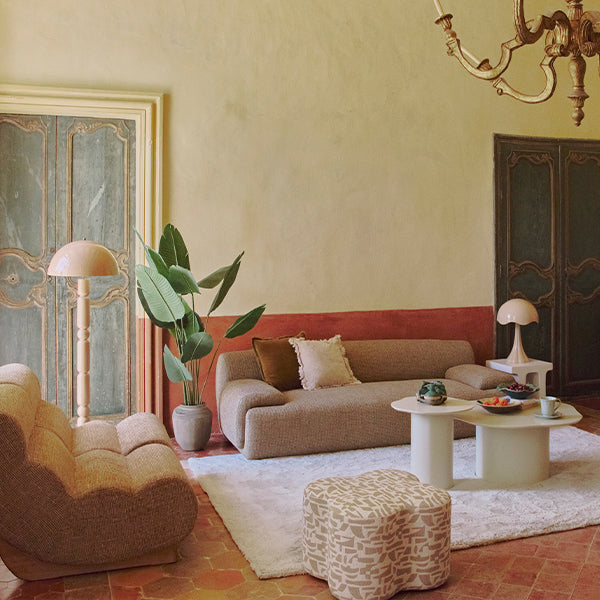
- Peach: A bright, summery tone, peach is a pastel color in the orange family. Its warm hues resemble luminous cream, making it an ideal color base on which to build.
- Layette blue: Similar to sky blue, layette blue is a light shade of azure that blends well with pastel yellows and pinks. Layette blue is also characteristic of children's bedrooms.
How to use pastel colors?
By combining the right colors, you can effectively incorporate pastel colors into different interior design trends. Try the following steps to work with pastel colors:
- Create a pastel color scheme: As an arrangement of complementary color combinations, a color scheme is a base that balances light and dark shades. Start by choosing a pastel color as a base. Select complementary colors by associating this main color with hues at opposite ends of the color wheel. If your color wheel doesn't include any pastel colors, find the primary color closest to your pastel color, then note the color opposite it. The pastel version of this second primary color is your complementary color. Here's an example, if pastel blue is your main color, use pastel oranges as complementary colors in your color palette.
- Test your shades: Before applying a color to a new space or model, test your color scheme. Pastel colors appear differently depending on how the light hits them. Consider doing a small test on a sample to make sure you like the way the color looks after you've applied it.
- Incorporate contrast: Contrasting colors highlight different aspects of your design. Pastel on pastel can give a look that's hard for the eye to perceive. Instead, layer your pastel background with contrasting colors.
- Add an accent: For a more dramatic look, you can incorporate accent colors into your design. Soft pastels amplify the appearance of bright colors. To make a statement in your design, consider incorporating a primary color shade into your palette. For interior design, use primary-colored cushions to accent a pastel-colored sofa.
Three top tips to keep in mind when using pastel colors
Consider these style tips for using pastel colors in graphic design or interior decorating:
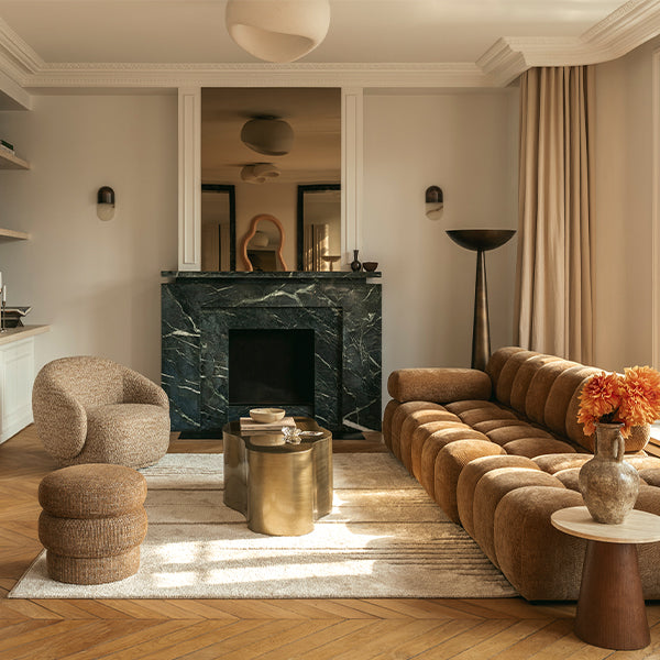
- Add metallic hues. As pastel colors are less saturated, metallic colors, such as gold and brass, draw attention away from pastel backgrounds. Experiment with different metallic hues to add texture to your pastel look.
- Play with patterns and shapes. Pastel backgrounds are an opportunity to incorporate bold shapes and interesting textures. Consider adding a geometric pattern to a pastel accent wall. The soft gradient of pale colors allows unique shapes to stand out.
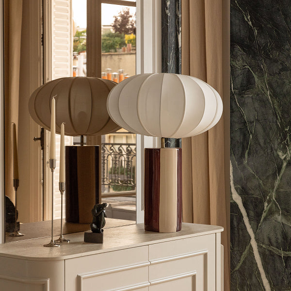
- Use neutral colors for balance. Adding a pale hue to a neutral color palette creates a fresh, eye-catching look. Neutral colors, such as white, gray and beige, help to blend pastel shades and avoid too much color mixing. This technique works well for business cards and logos.

