What are the most soothing decorating color combinations?
When it comes to the most soothing color combinations in decorating, it's essential to understand how shades can transform a space. Choosing the right colors is more than just a matter of taste; it's a way of influencing the atmosphere of a decor, making our homes not only more beautiful, but also more comfortable and restful. In this article, we'll explore color palettes that promote relaxation and tranquility, helping you create the ideal home environment.
Neutral tones for soothing simplicity
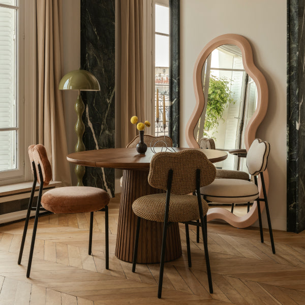
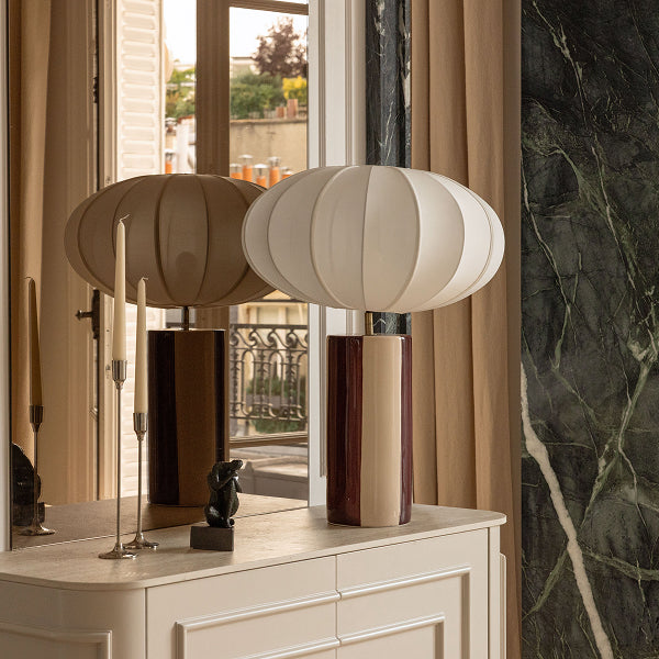
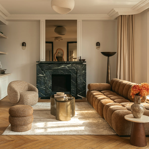
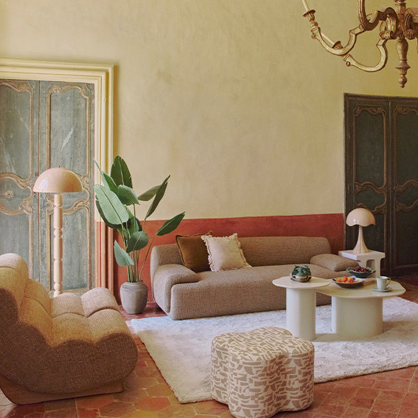
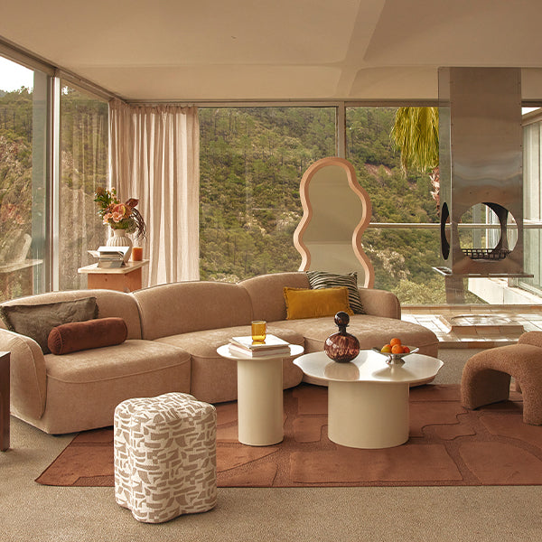
Neutral tones such as beige, taupe and ivory offer a subtle, sophisticated alternative for those who prefer a decor that is less vibrant than with brighter colors, but just as elegant. These colors provide an ideal neutral backdrop for accenting decorative accessories without visually overloading the space. They are perfect for living rooms where comfort and relaxation are essential. The use of these shades in a variety of textures such as jute rugs, velvet sofas and walnut or oak woodwork can add a dimension of warmth and naturalness to the room. What's more, the integration of subtle nuances such as ivory cushions or taupe curtains can enrich the overall ambience without compromising the tranquility and elegance sought.
Blue and grey: a winning duo for a zen ambience
Blue has inherently calming properties, making it a preferred choice for interiors seeking to promote tranquility and well-being. When combined with shades of grey, blue can radically transform a room into a haven of peace. This color palette is particularly effective in bedrooms and offices where concentration and calm are required. For example, a light sky blue combined with a soft grey can soften a room's energy while maintaining an airy, bright atmosphere. To accentuate this sense of calm, the integration of textiles such as blue-gray linen curtains or gray velvet cushions can complement the overall aesthetic, offering a soothing visual and tactile experience.
Sage green and white
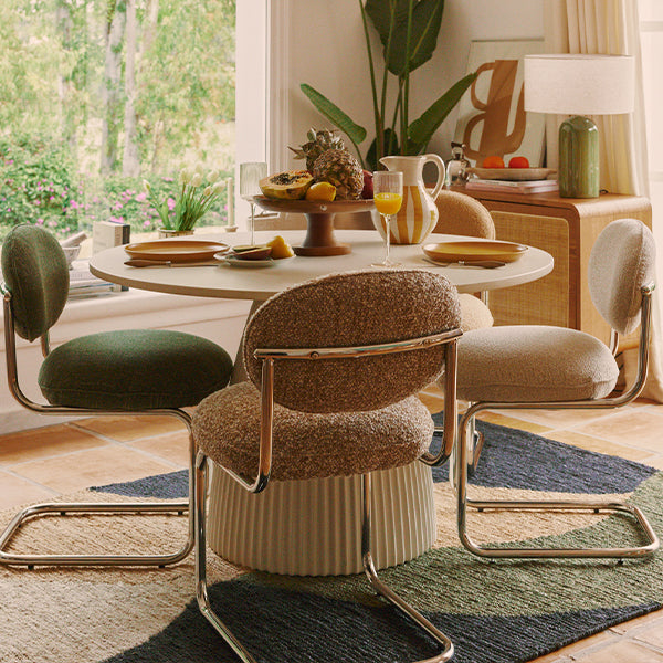
Green recalls the natural elements of the outdoor world, bringing a breath of fresh air to any space. Combining green with white creates an ambience that can both revitalize and relax. This combination is ideal for rooms such as living rooms and bedrooms. Consider, for example, shades such as sage green or water green, which are soft enough to create moods that exude tranquility.
The soothing power of monochromatic combinations
The use of monochromatic combinations in interior design offers a visually harmonious result and can significantly increase the level of tranquility in a space. Adopting a monochromatic scheme doesn't mean limiting oneself to a single hue with no variations, but rather exploring the full range of a specific color to visually enrich the space without making it chaotic. Take, for example, a palette of blues: from pale, almost translucent blues to deep blues, each shade can be used to paint walls, choose upholstery fabrics or select works of art. This technique creates an environment that encourages concentration and relaxation, ideal for rooms such as living rooms or offices where calm is essential. What's more, the addition of varied textures, such as dark blue velvet cushions or light blue rugs, can introduce depth and visual interest while maintaining aesthetic unity.
How to choose the right combination for your space?
Selecting the right colors for an interior is an opportunity to think about the mood, emotional and psychological effect you want to create in your home. Before deciding, it's crucial to consider the desired ambience. A space that encourages relaxation, stimulates creativity, or lifts the mood? Each color has the potential to influence the state of mind in a different way. For example, shades of green can revitalize a space while bringing a sense of peace, while soft oranges and yellows can inject energy and optimism into an office or kitchen.
It's also important to consider the amount of natural light that enters the room. Daylight can radically transform the appearance of colors. A green that looks vibrant and energetic under strong natural lighting can become more sober and softer under more subdued light. To avoid unpleasant surprises, we recommend testing paint samples on walls and observing them at different times of the day. This will allow you to see how color interacts with changes in natural and artificial light. Adding elements like mirrors can also influence color perception by reflecting light and adding an extra dimension to the space.
Conclusion: the best color combinations for soothing interior design
Choosing the most soothing color combinations for your interior design is not just a question of aesthetics, but also of well-being. Colors have the power to transform our moods and productivity. By incorporating the color palettes we've explored, you can not only create an environment that reflects your personal style, but also a space that promotes relaxation and calm. Feel free to experiment with color and find the perfect balance to suit your needs.

